Senior designer.
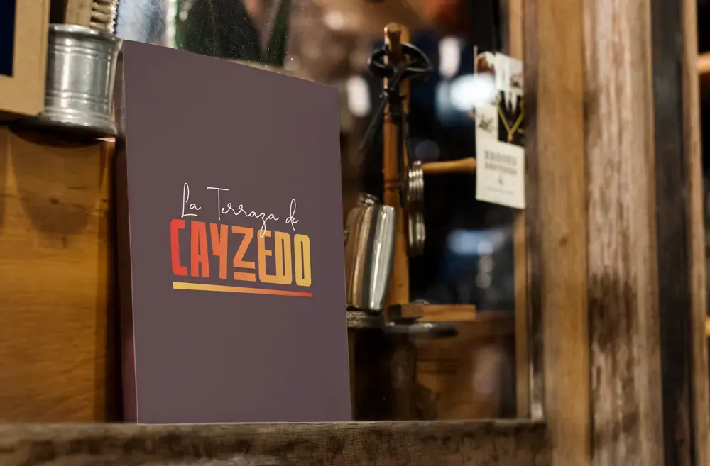
A new brand for a local restaurant located in the heart of downtown.
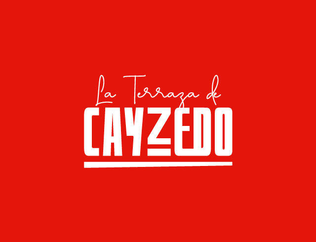
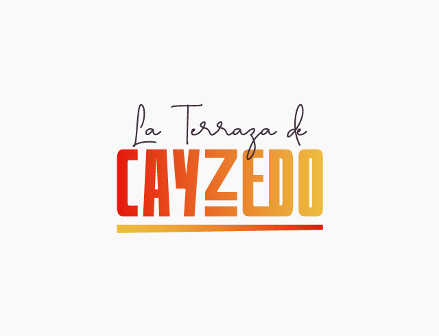
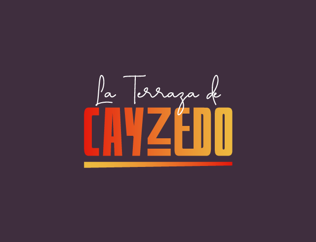
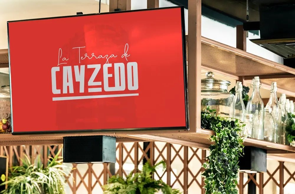
Designed a logo for a new restaurant blending historical charm with modern style.
Requirement:
A newly established city restaurant needed a professional logo to strengthen its brand identity.
Solution:
The logo design incorporates two distinct typographies. The first is a calligraphic font that evokes the 1800s, a nod to Joaquín Cayzedo y Cuero, the namesake of Cayzedo Square. This font choice reinforces the concept of unity, symbolizing the historic roots of the area and the restaurant’s connection to local heritage.
The second typeface is a bold sans-serif that provides strong contrast with the calligraphic font. This font reflects the 1950s, the era when the Hotel Asturia was built, adding a touch of classic elegance. The conjoined letters ‘E’ and ‘D’ in “Cayzedo” graphically emphasize the theme of unity.